Go back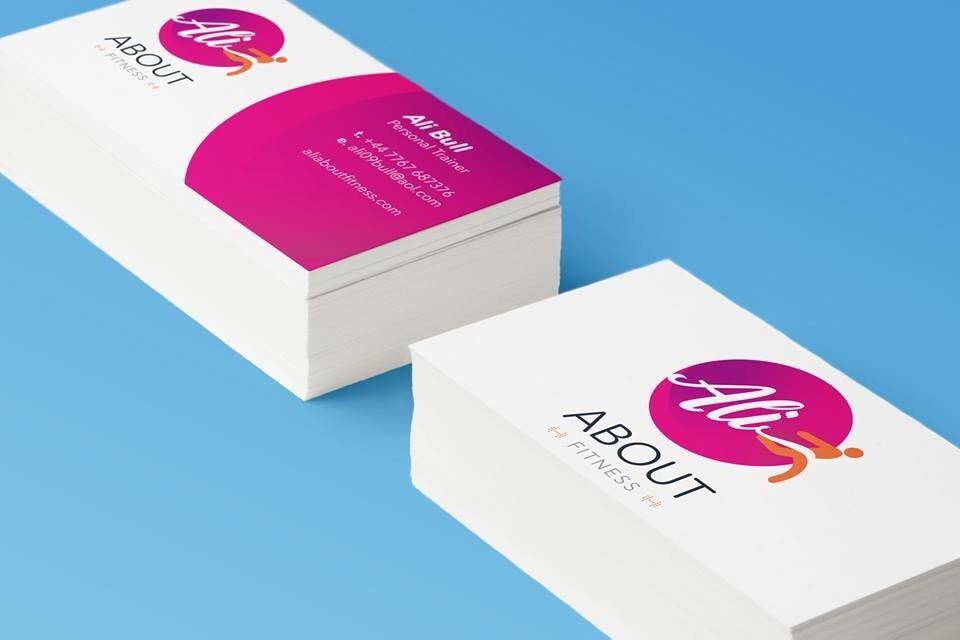
Alfa I think you could do without the gradient but the overall design work is very good!
Bravo I like the gradient!
Alfa It is nice on the logo but perhaps not on the background element on the back of the card..(?)
Alfa The back side could be simply text. No need to reuse the front logo on the back.
Echo The design sits very close to the edge of the card... Give it some room to breathe. Also, in my opinion the logo is very generic.
Echo ...also, why 'about fitness,? Is 'about' the name of the company? Because it's very large. Makes me feel like I'm looking at a website menu. Surely the word 'fitness' is more important than the word 'about'?