Go back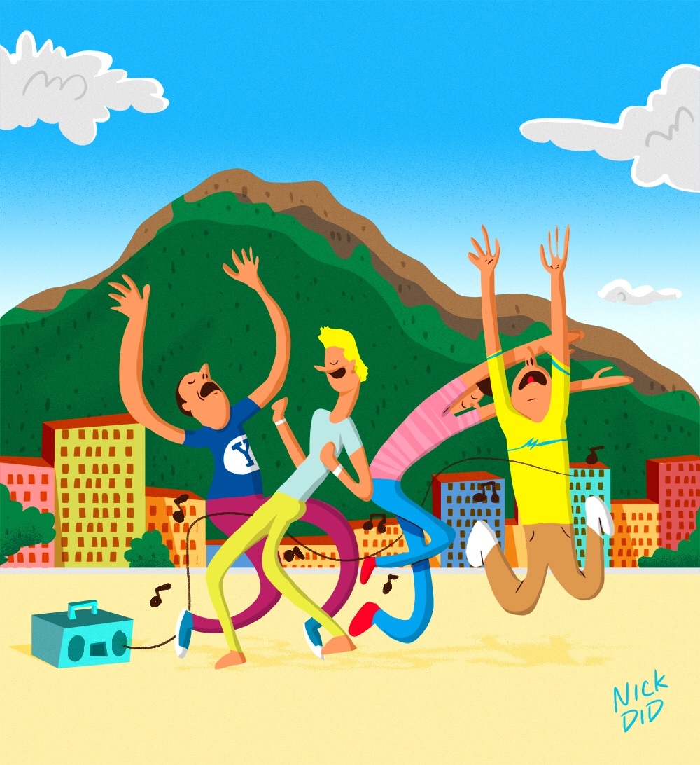
Alfa Fun illustration - the only bit of feedback I have is that the music line feels quite static, and my eye had to follow it back to the stereo to see what it was. Maybe there's a better way of representing it?
Bravo ^ wonderful comment. I agree completely.
Charlie I struggled with that mighty be better to not have it, that's the one part that I am least happy about. Thanks for the feedback!
Alfa I would consider making the music notes the same colour as the stereo (so they stand out more), and adding more of them scattered around the people.
Charlie ^ ooh!! I like that!!
Bravo You don't need the line. Let the notes be the line. Everyone knows where the music comes from. I'm so glad you uploaded your work. Really started to worry, to only see sad design.;)
Alfa Glad I could help.
Hotel Make the notes white, the line kinda has no purpose there.. Otherwise looks good! Like the colors :)