Go back
Alfa Best part about this is the hashtags
Bravo Well done!
Charlie What kinda paper did you use?
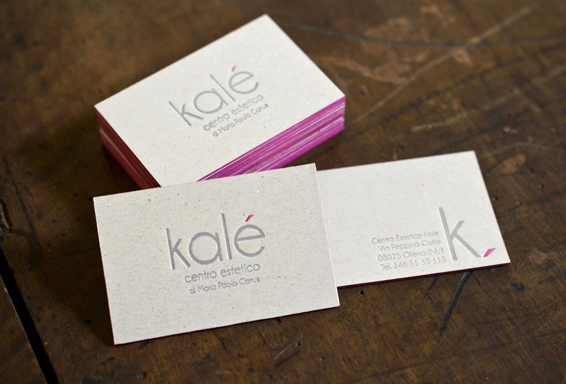
Delta lol as for the hashtags it's just me having a bad user experience with this app (sorry admin :)) the paper is a 600gsm "grigio grigio"
Echo This sucks
Charlie At least be constructive
Delta your argument is invalid, sir
Hotel Good paper, letterpress and colored edges don't hide weak design.
India What's weak about it? Mr hotel
Hotel Well for a start: There is little connection between side 1 & 2. Side 1 is all centered-centered. Side 2 all of a sudden the content is right justified and the k is to the the right. The block pushed to the bottom.
Hotel Ps. I'm mrs. Hotel ;)
Bravo I don't see any weak design in this...
Hotel To be the devils advocate now. Why do you think this is a strong design?