Go back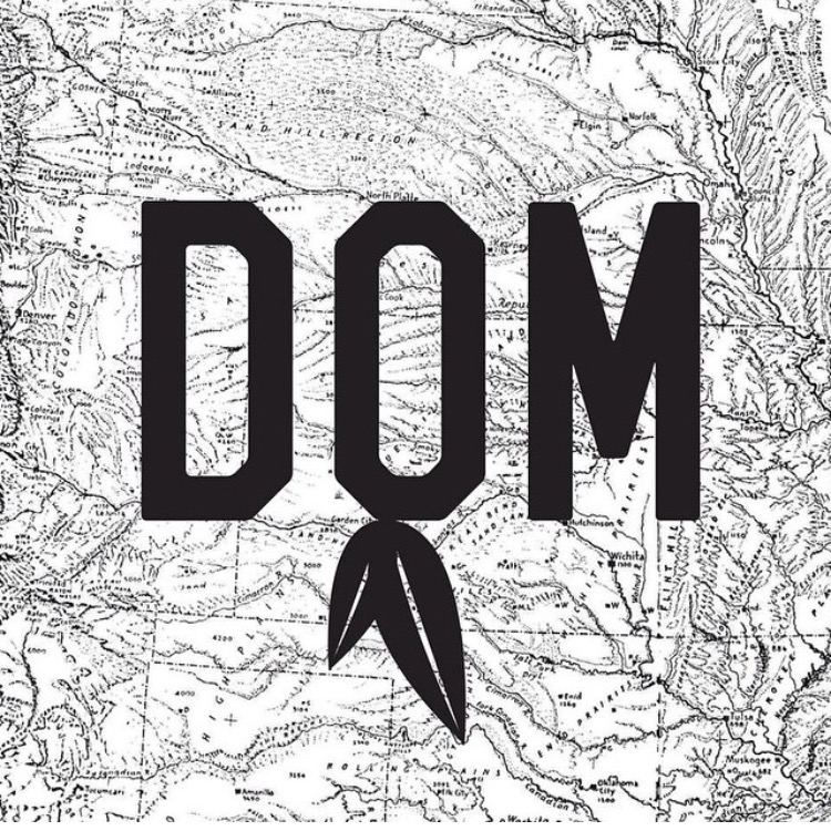
Alfa The leafs should probably have a boxy feel too, just like the letters.
Bravo Yes what alfa said. In addition the map should be removed.
Bravo What alfa said. Also the map should be removed. Can you tell us a bit about why you have chosen the leafs and this font? Then its easier to critic it.
Delta The choice of the font and leafs was a play off of sports team logos, through the use of a classic sport font with leafs similar to those in the Chicago Blackhawks logo, the map was one of many different baclgrounds
Bravo Ah ok. Thats a nice insider. And what does it represent? Dom is the athletes name? And this is the athletes personal logo? As suggested before, remove the map, and make the leafs match the font.
Foxtrot You should try the Leafs as negative space in the O