Go back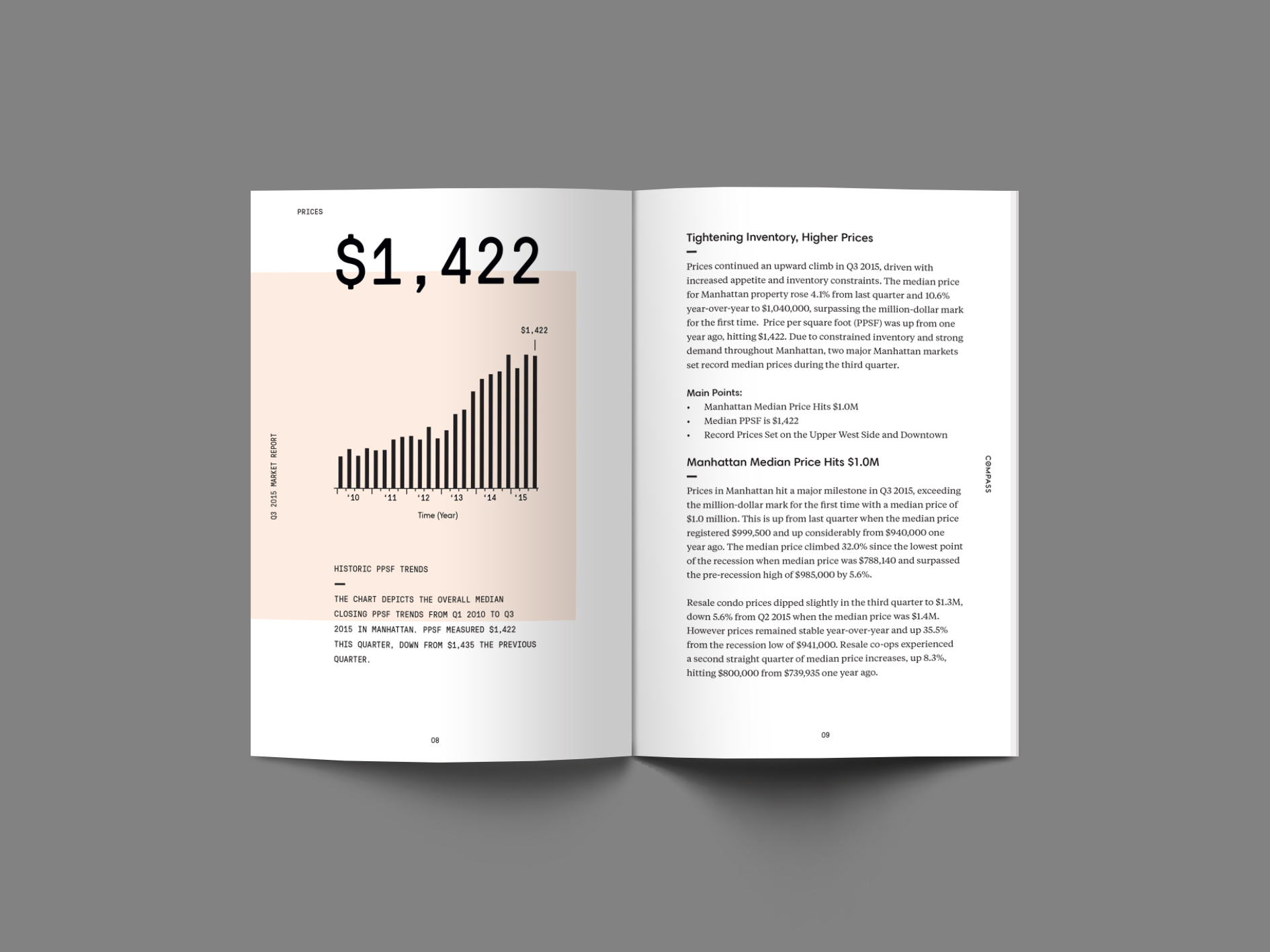
Alfa is that a photo or 3d mockup?
Bravo 3d mock up, I'll get it printed once I'm done designing it
Charlie Where did you get this 3D mock up from? Or did you create it yourself?
Bravo Lol I found it online, any crit for the book layout?
Delta What's the context of these pages and why the peachish background for the graph?
Echo Did you take my advice on your earlier post about visiting designspiration for some ideas? The page on the left is working ok, but the page on the right looks very dull. Doesn't make me want to read it.
Echo Also, Alpha and Charlie, do you guys have the Internet? Mock ups like these have been around for years. And years. Everyone uses them.
Charlie Could you send me the link to where you found this mock layout from?
Echo Gah, this is so frustrating. Charlie, do you ever visit design blogs? Can you use google? Google page layout mockups. They're available everywhere. PSDCovers for one. Or make your own, you're a designer
Delta Maybe he's not. There would be no questions to ask if everyone could use google. I think the layout on the right is fine, it is a book not a flyer/poster, so simple readability is key.
Bravo I did, thanks. I always look at plenty of inspiration from blogs. This is for a corporate client, the text needs to be legible. I guess I'm hoping to find a happy medium of it being neutral while playing off the left side.
Bravo It's a market report, with dense information. The peach is brand colors, I was playing blocking off random parts of each layout with the peach tone
Echo There are a few fundamental issues with the typography on the right. Firstly, the space between the bullets and the text is too large. Also, the gap between paragraphs is the same as the gap betweeen paragraph and header.
Echo I also find the use of the line after the title strange. Surely it should go before the title? Also, I find that sometimes bullets are a nice way to inject some personality. Is there a shape related to the brand that you..
Echo ...could use? Or at least make them brand colours? Maybe the titles can be a brand colour, to break up the black a little?
Echo Also, pull quotes can be a nice way to make a corporate layout much more interesting