Go back
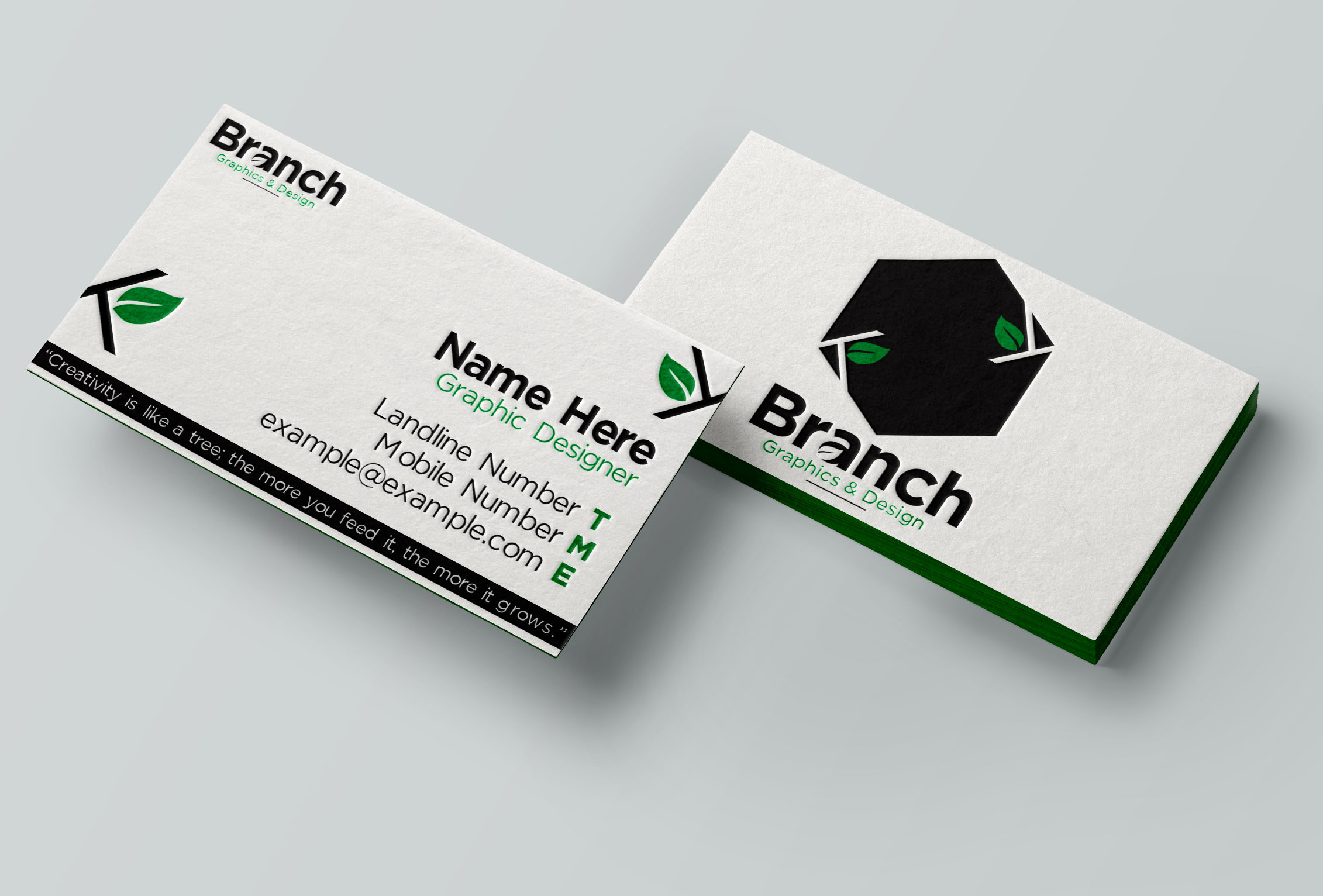
Alfa Can someone give me some feedback on this please? Personally I think the logo is a little plain, but I've been told it works well? In two minds about this! Thank you! 😊🍃
Bravo I'd get rid of the dark band on the bottom, it distracts from what should be important, name and number.
Charlie Feedback on buisness card: too much going on. My eye jumps from one info to the next, but not lead by your layout. Think about what do you want to see... Eg. Page 1: contact info. Done. Page 2: make it a surprise habe it
Charlie All black with the logo 'branch' and if you want to that sentence about design. :/ done!
Delta Maybe put the quote on the back?
Echo Agree w above. And the box makes no connection to branch..
Alfa Thanks guys! This why I love this place, I get so much good feedback! I'll do the amends tomorrow and post again, so keep a look out!
Foxtrot Maybe add more air )