Go back
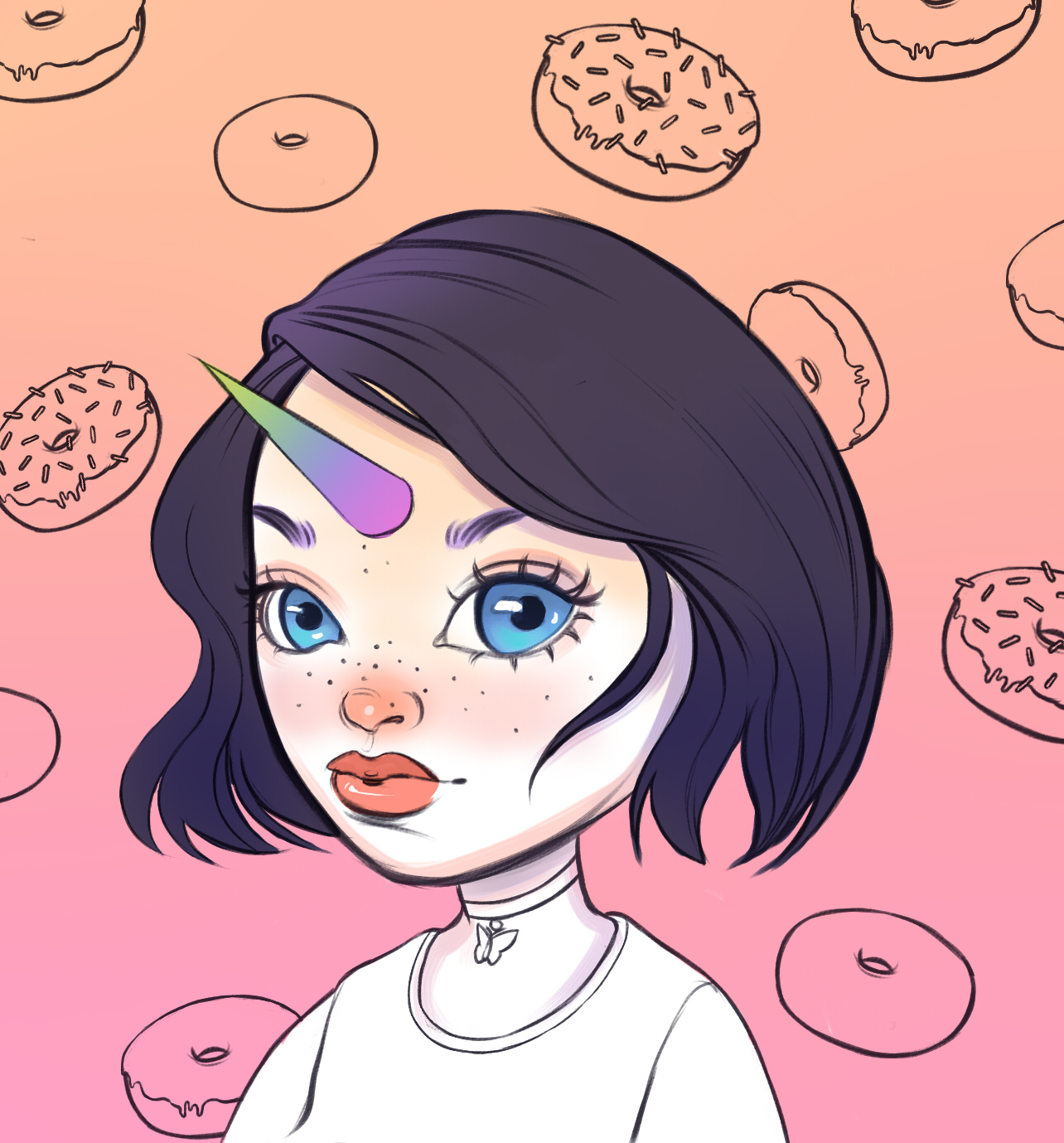
Alfa She should try an catch one of those donuts on her horn
Bravo The girl is great and donuts too. The unicorn could use some shadows, it's very flat.
Charlie I'm obssesed with her eyes.
Delta The design of the girl is very well executed, but i agree with bravo. The unicorn is off. Perspective doesn't fit and shadows are missing.
Echo I was thinking of adding a little donut on her horn too! But I'm sort of perverted and worried that a donut hole with a giant phallic horn going through it on a little girl's head is too much. But maybe that's just my sick mind 😭 thanks for the advice guys, I'll fix the horn today!
Delta That peverted idea is good. I like.