Go back
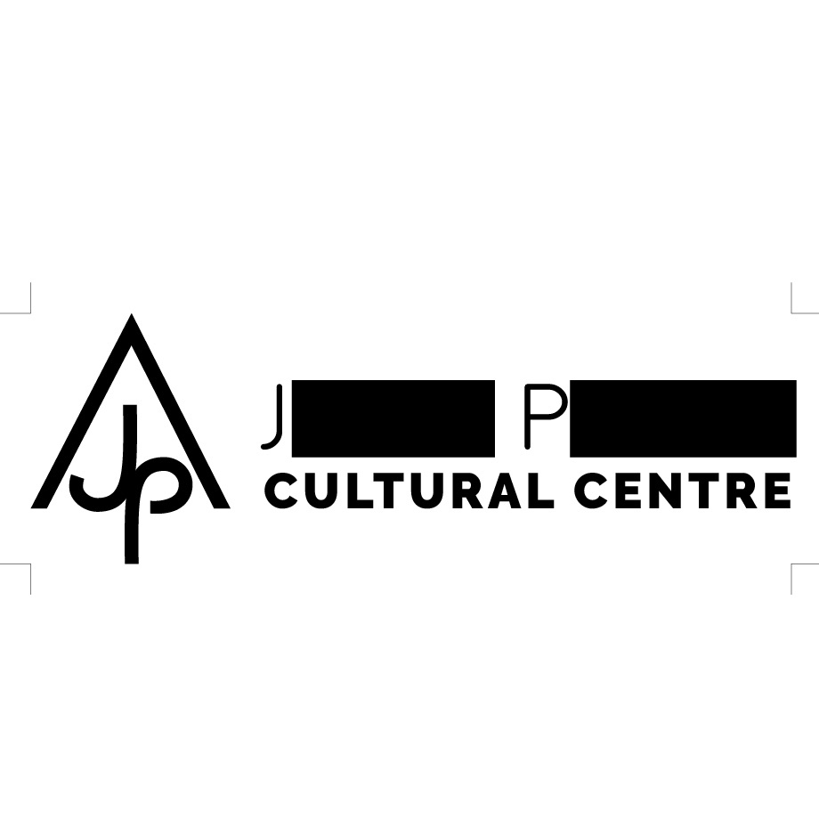
Alfa I like the concept, it'd be nice if the j and p were the same size.
Bravo They actually are technically, but I could tweak that optically. Thanks!
Charlie Far too much going on I reckon. 3 typefaces clash, the logo mark feels clunky & needs crafting. I understand you've censored the name but it doesn't help the design by adding two more blocks of dense black. I'm also struggling with heirarchy - what do you want us to look at first?
Charlie It all sounds negative but I think you could do so much more with this. Strip it back to basics and really refine it so it feels more premium. You could introduce colour to break it up and help the eye path. Try running the name underneath the logo mark? 🙂