Go back

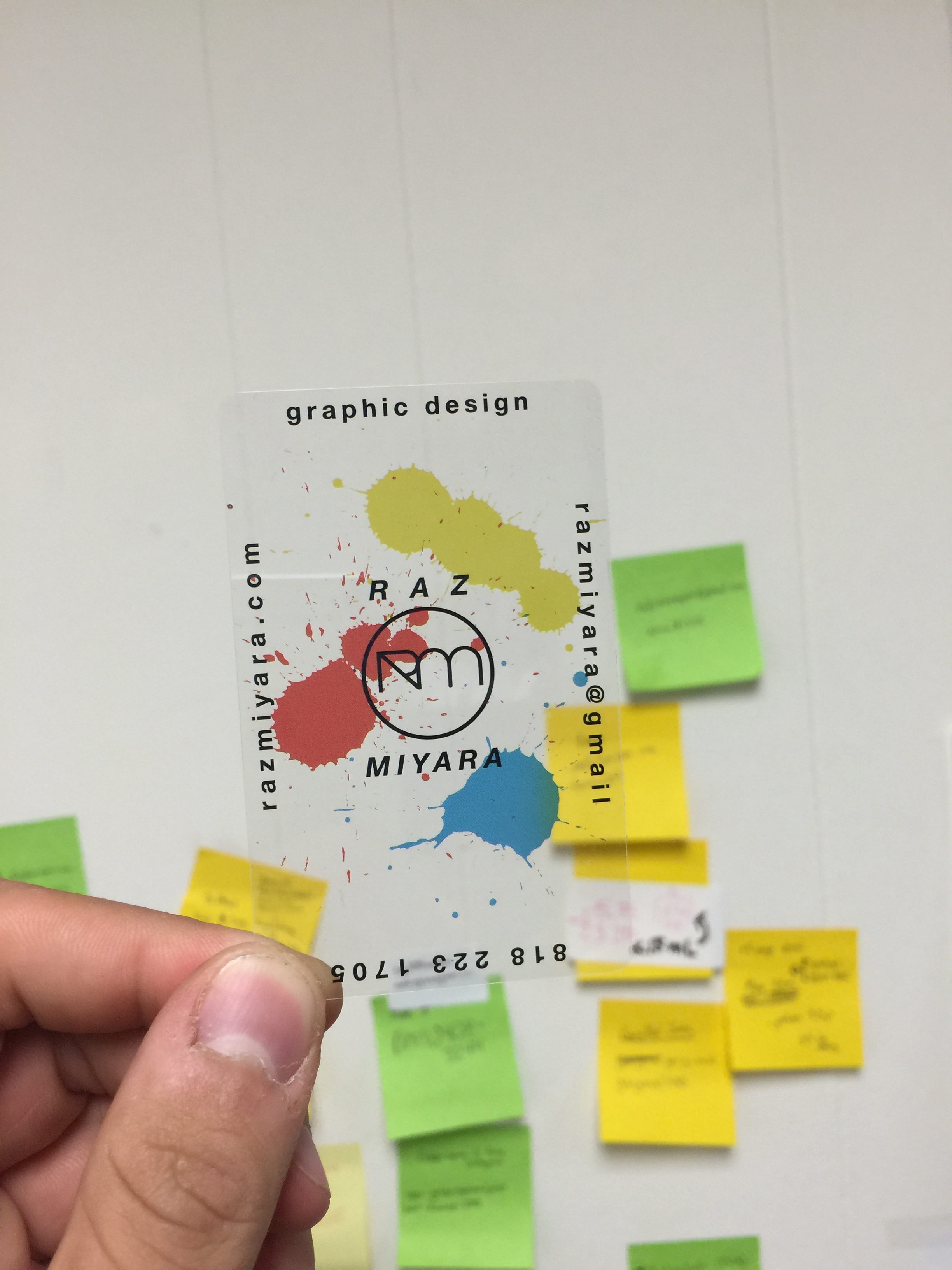
Alfa Cool, I'd definitely put the .com after gmail tho.
Bravo Somewhat 80's. Which isn't bad. However too many different styles are used in my opinion.
Charlie Yeah too many styles. I like the splatters.
Delta Why's it transparent?
Echo I agree with Alfa, bravo, and Charlie. Otherwise it's really cool. And @delta lol because transparency is cool. That's the whole point of the design obviously.
Foxtrot where the red splatter meets the name is too congested