Go back

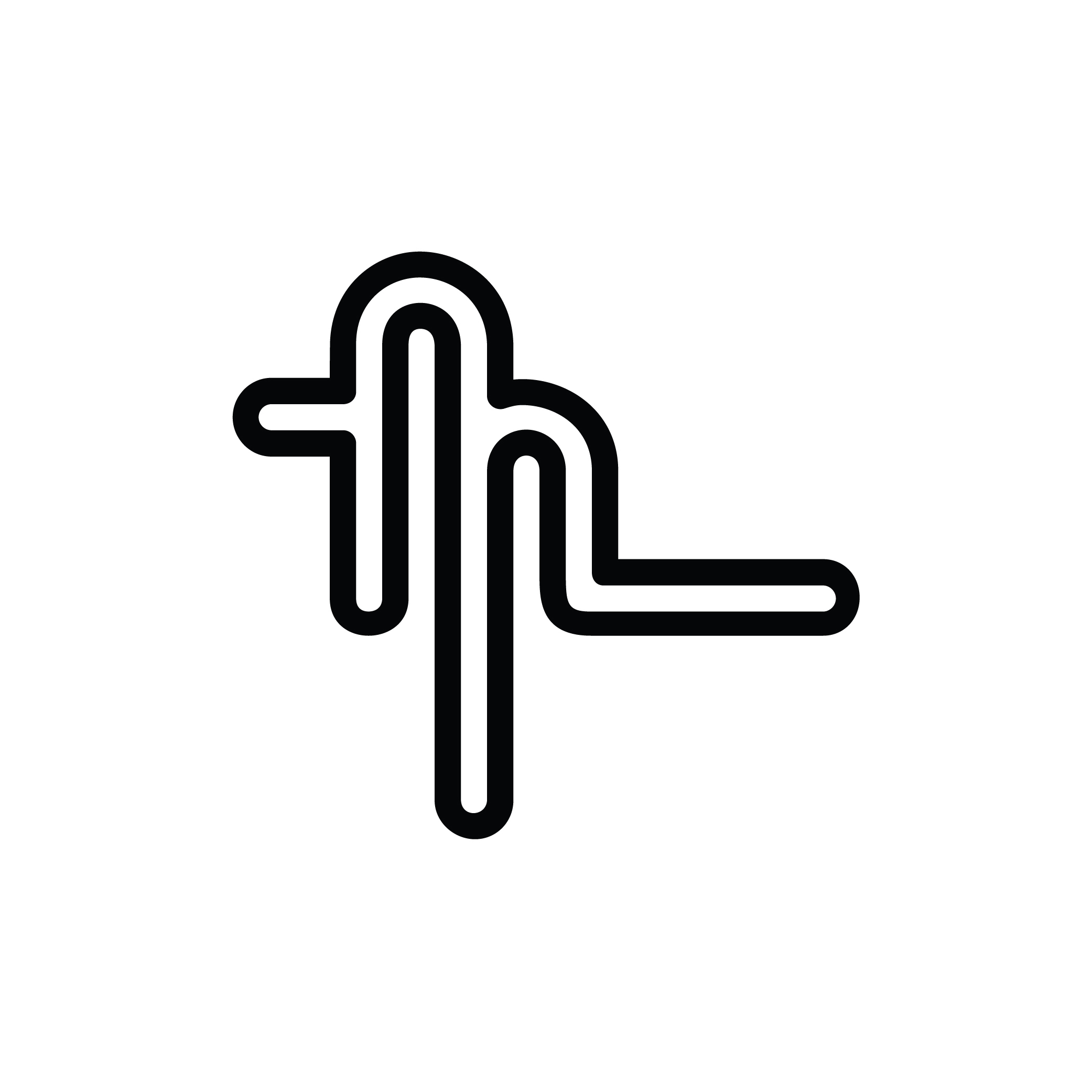
Alfa What is it?
Bravo As in, what letter is it, or what is it being used for?
Alfa Both
Bravo An abstracted "m", personal branding
Alfa It'd be clearer without the line on the left, it also breaks the flow.
Charlie I disagree. The left line in my opinion suggests a small m. In addition too the line continues on the right. It makes it more interesting and overall it adds balance.
Bravo Thanks guys, it's still a work in progress. It's challenging because I want something clean, but also a little playful and weird.