Go back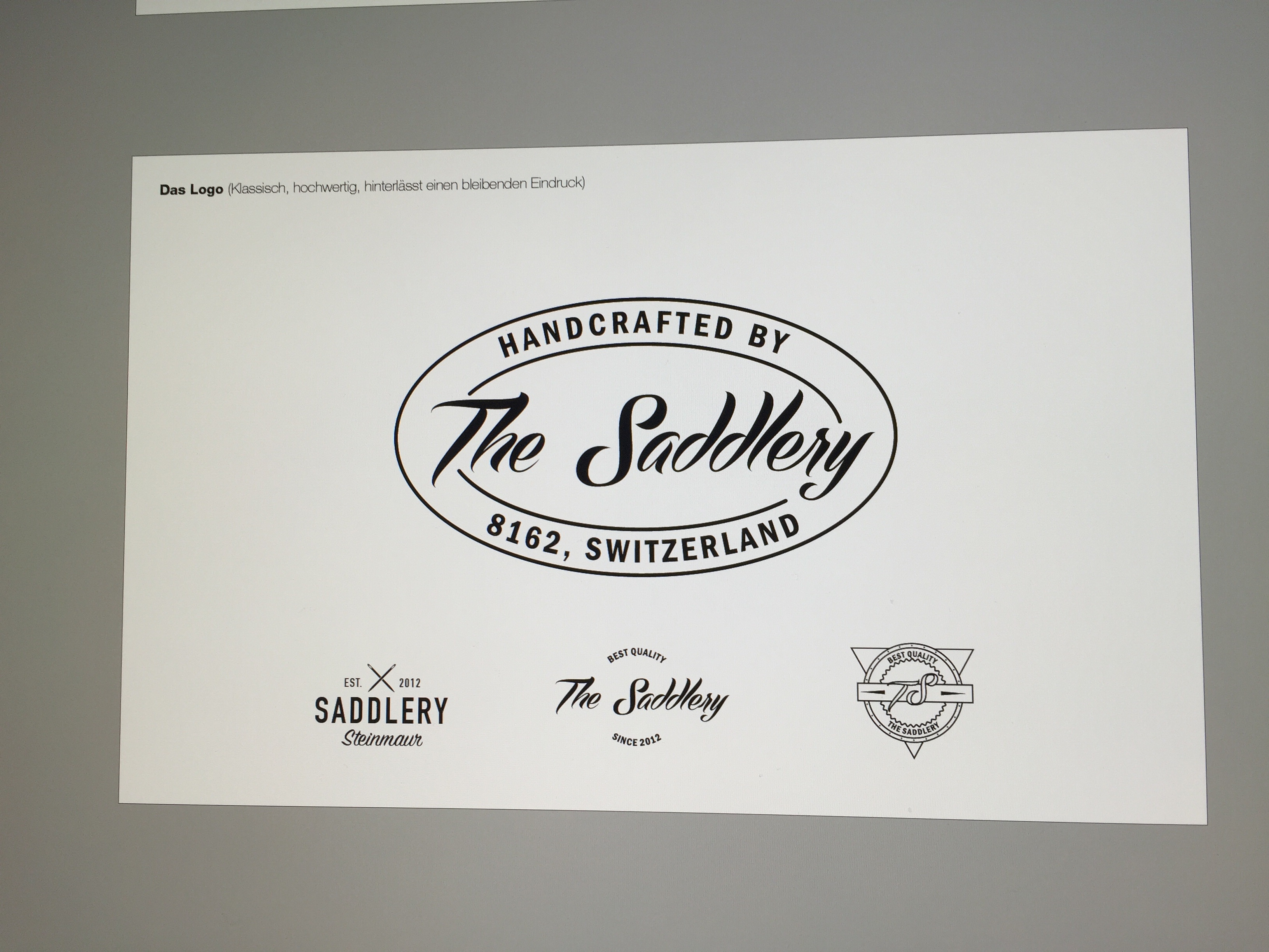
Alfa Project im working on
Bravo The hipstery one, bottom left
Charlie The large centered one. Nice type treatment!
Alfa Haha they are all hipster logos i think xD
Charlie They definitely are all hipster logos. :)
Delta Bottom Left
Echo Even though all of the designs are well executed (good balance and hierachy etc) they all lack 'personality/individualism'. What is their buisness target audience? Hipsters? And what makes them better than their competition? To me these designs aren't saying much but that they were designed in 2015-16.:)
Echo I have to add one little thing that i just realized, the space between the Saddlery is a bit too large.
Alfa 👍
Foxtrot Very good
Golf Reduce the spacing between "the" and "saddlery" in the main top logo and logo number 2. I do like the direction of this but feel like it does lack character.
Alfa @golf thx, really looks alot better with less spacing!