Go back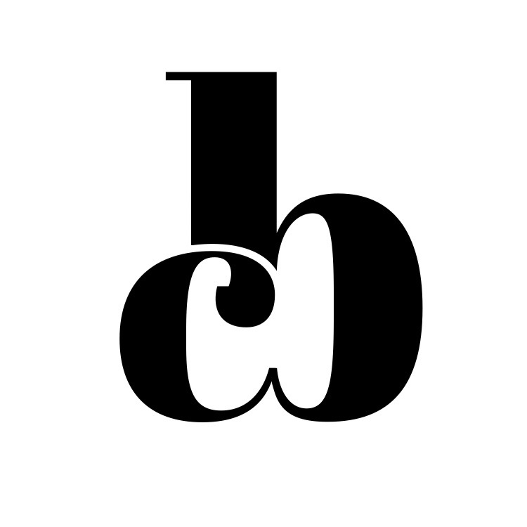
Alfa Been working on this as a personal logo and don't know what else I should do to make it pop. Suggestions?
Bravo Bigger C cause it reads bc right now
Alfa Good point. I'll work on that, thanks
Charlie It is coming across slightly rude to me lol But I agree with bravo
Alfa Gotta be willing to take criticism however it comes. Doesn't bother me!
Delta I think the x-height of the letters should be consistent. Please refrain from saying 'pop' as it means nothing. Careful you don't make it look any more phallic than it already does, otherwise you might get that 'pop' you're looking for. 😉
Echo Looks a bit phallic
Alfa If I kept a sliver of the stem of the b instead of cutting it off would it solve the phallic issue?
Bravo Haha probably.