Go back

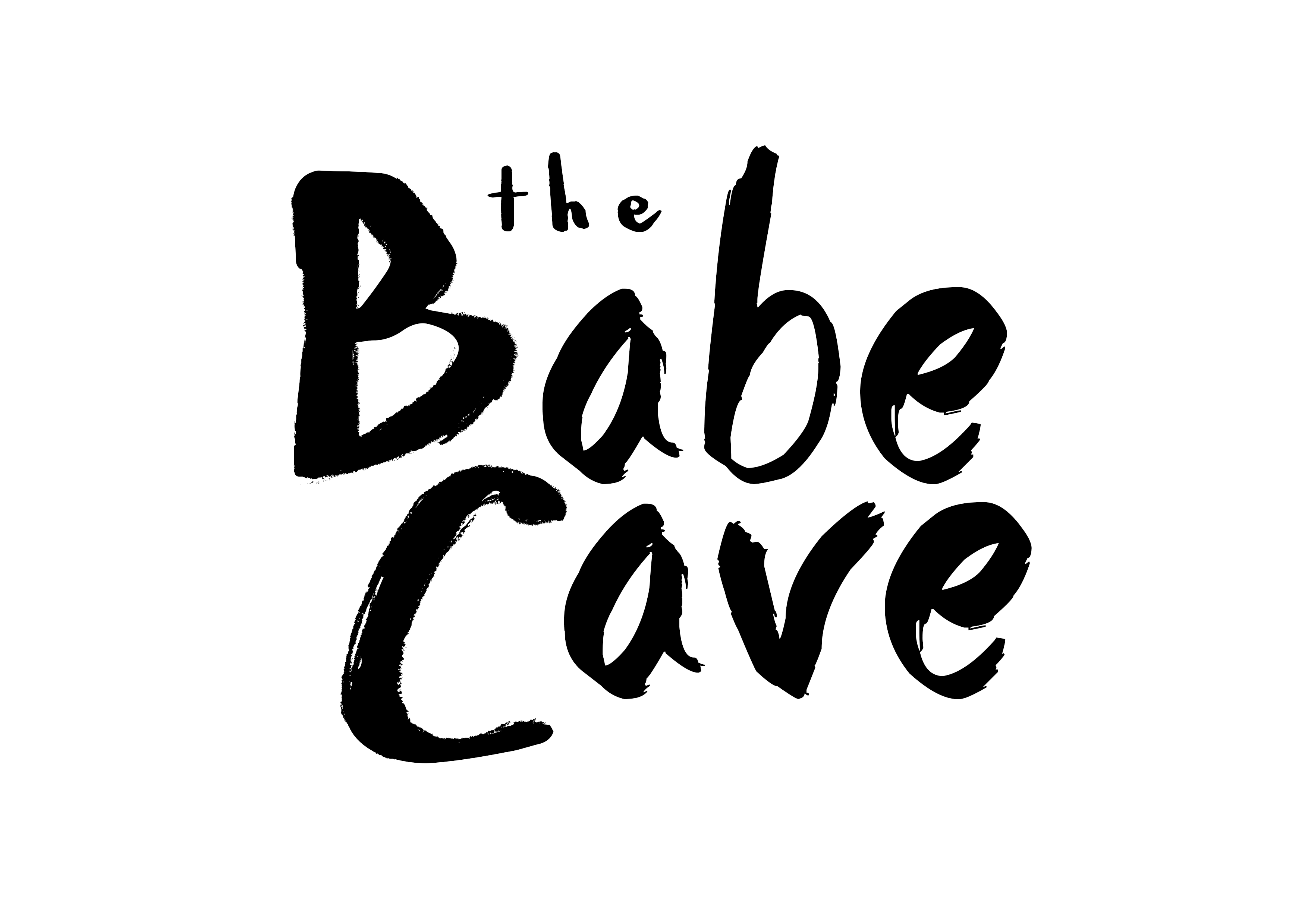
Alfa Nice, the B might be a little bold compared to the others.
Bravo Maybe thicken up part of the bowl of the "b". It looks a bit thin and mismatched compared to the other letters. (Not the entire bowl, just like the right side/bottom-ish, if that makes sense).
Charlie Good stuff guys. I just painted it onto a wooden board with the fixes and it looks great!