Go back

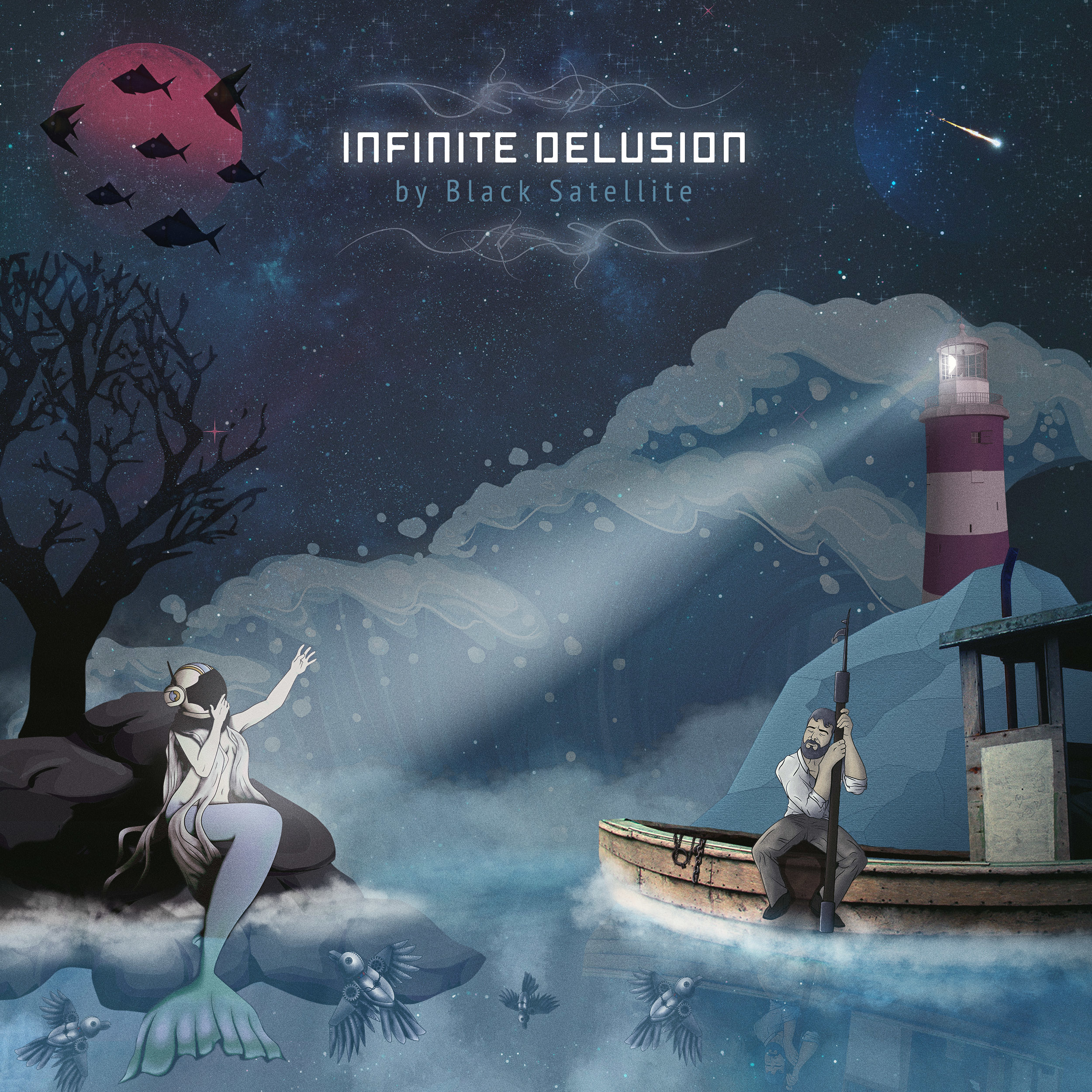
Alfa I've been told it would be better to have a lot higher contrast between the colors.
Bravo I dunno, looks pretty nice as is
Charlie I like it as is too. If you do adjust the contrast, pay attention to what you want to stand out most (the name? the beam of light? The mermaid?). Because things might start competing for attention and look messy if everything is very contrasty. But I'd say try out some more contrast to see if you like it better :)