Go back

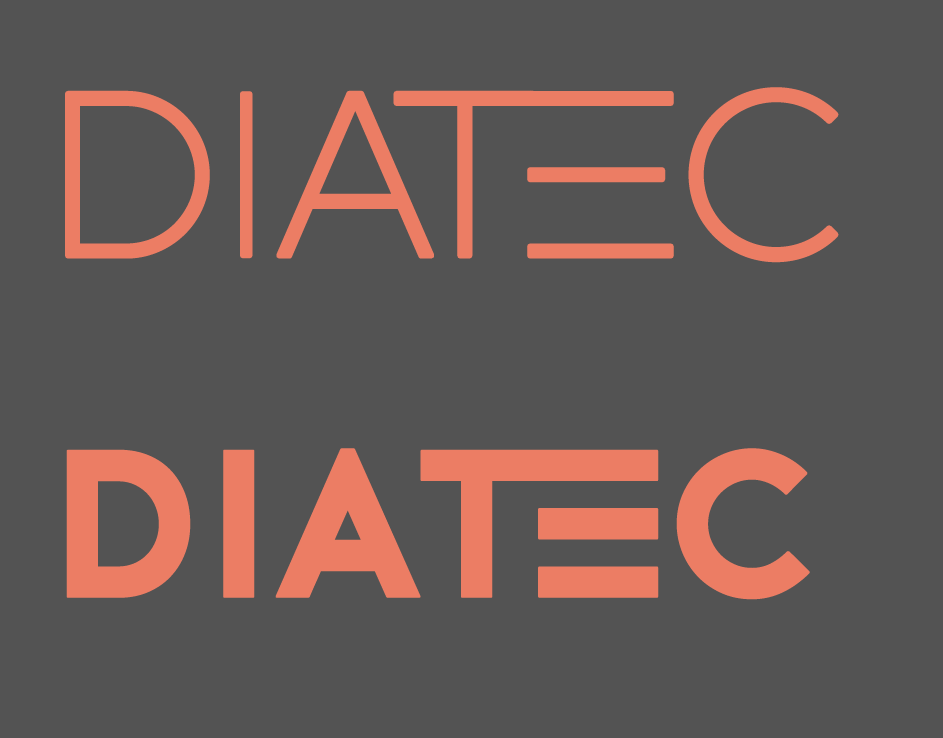
Alfa Much prefer this version to v1. Colours work and look a lot more appealing now!
Bravo So much better, like the thick one
Charlie Digging the thick one. Some of the kerning feels off though on the thick one. The D I A T feel more spread apart than the T E C.