Go back

Alfa Super clean and nice
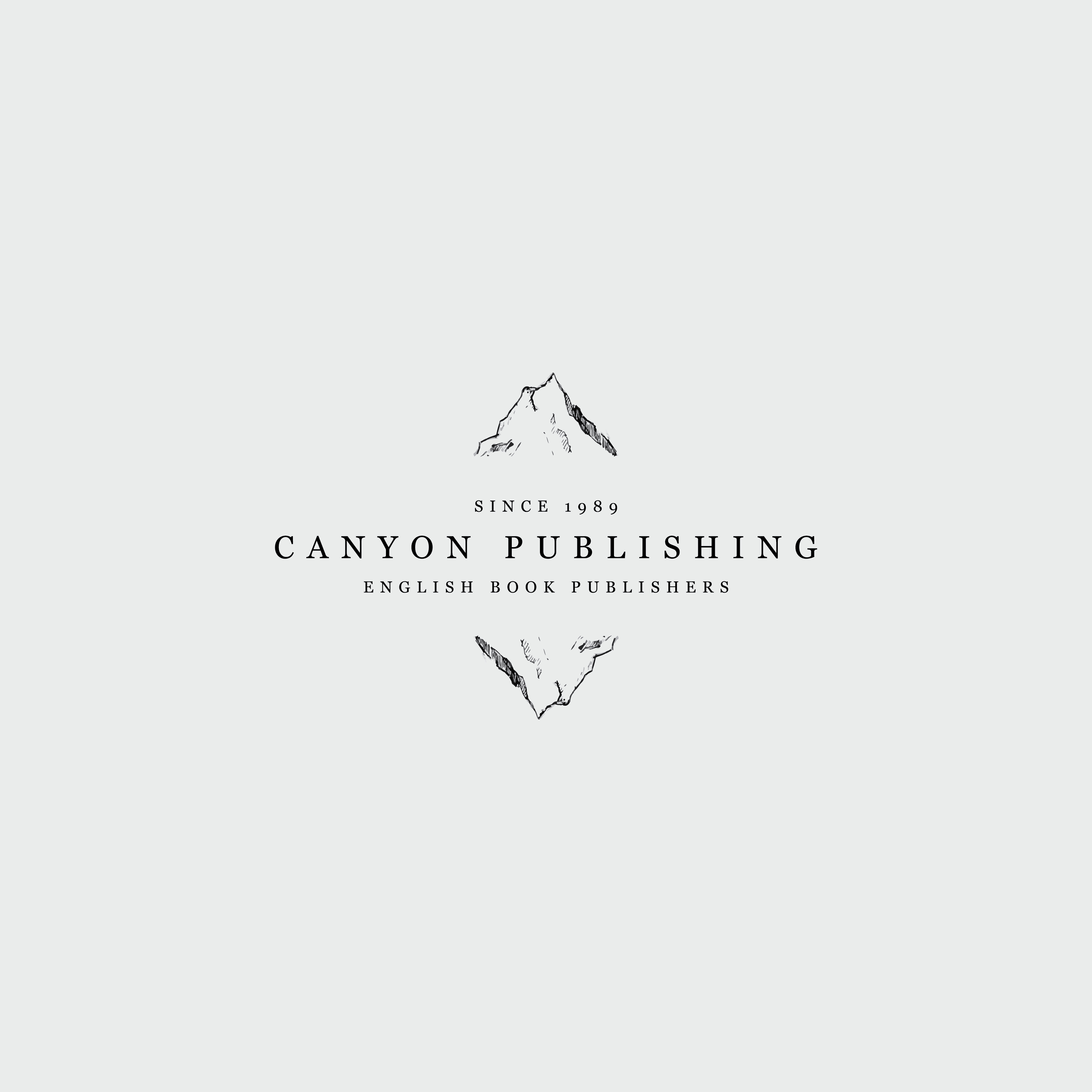
Bravo Nice work, but I'm not down with the bottom mountain being a rotated copy of the top mountain. Take the time to do a redraw but keep it similar.
Charlie Nice mountain sketch. But it feels disconnected and confusing as a logo... Canyon = mountain? The typography is nice. But I think a more creative or ownable logo/mark could be achieved.
Delta Maybe instead or rotating, try reflecting? Kinda like a-mountain-overlooking-a-lake kind of thing.
Echo Agreed with Delta. MIRROR not rotate
Foxtrot Could the bottom one be a canyon? Similar shape to how it currently is perhaps.
Golf I say lose the bottom canyon in all.