Go back

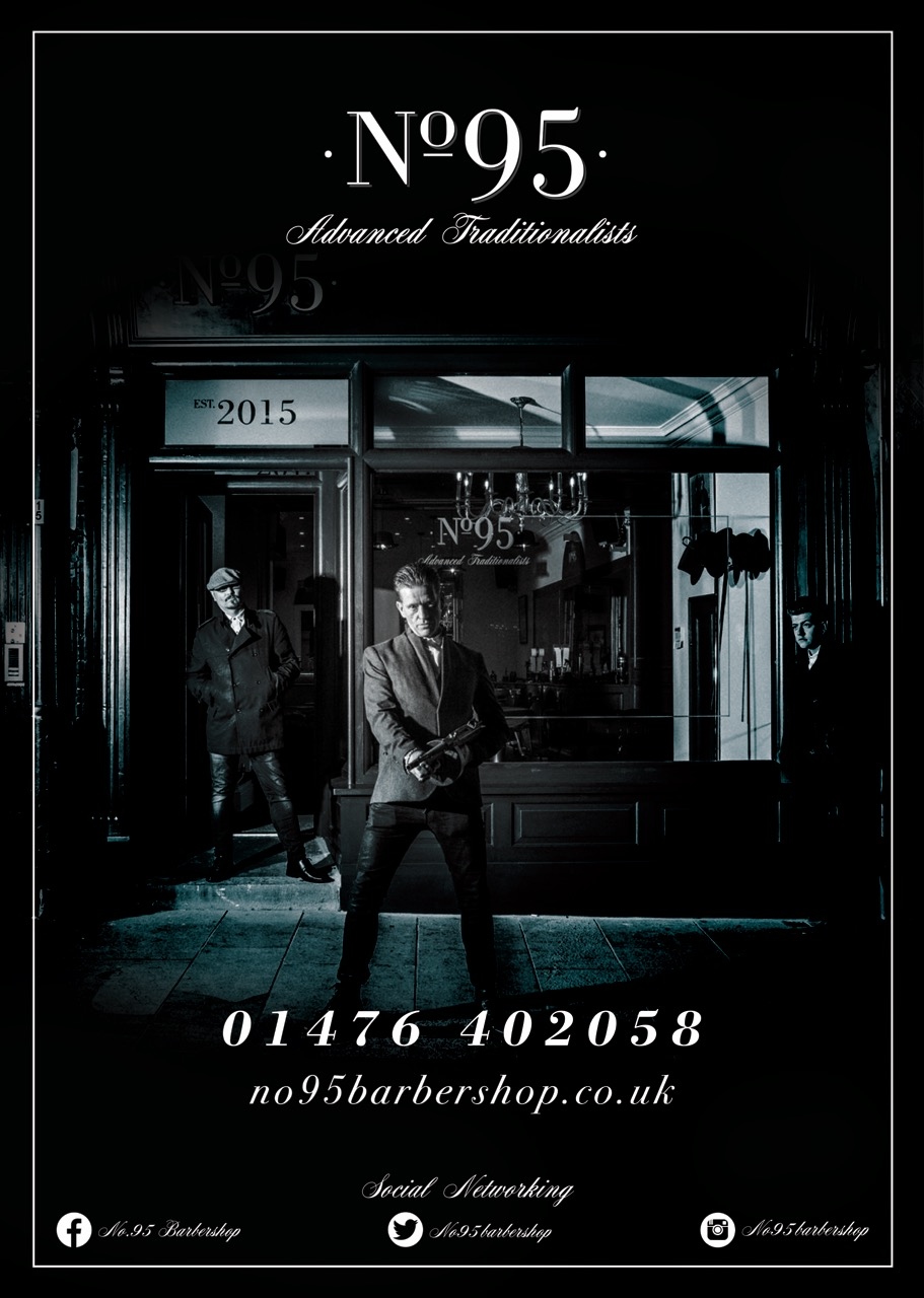
Alfa I wouldn't put the social media tags in that typeface: it's very hard to read. Also it's not necessary to write "social networking" because it's common practice to just put the social media logos and everyone understands what that means.
Bravo It was just to tie in with all of the other stationery that he has had done. Works well as it is a traditional barbershop set before the social media era.
Charlie Respectfully, I don't think it discredits my notes. Legibility is a problem. The main point of a poster or flyer is to communicate and I think it's not achieving that goal due to legibility. Even using the typeface used for the numbers and url would be better. And I still think the poster would be clean and look nice and match well without the "Social Networking". It's superfluous.
Delta I agree with above. Also, the actual social media profile names are impossible to read
Echo Agree with the aboves. That script doesn't work with what you are trying to relay with the picture. The serif font works great with the era, the script font looks more like a font for a cotillion or something.