Go back

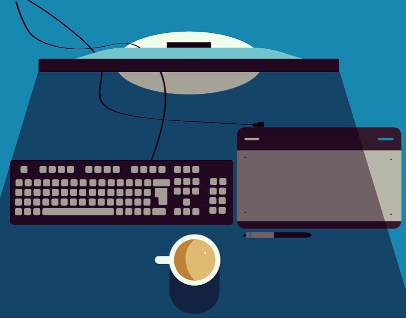
Alfa This is my first flat illustration, just a begginer on the design world. Feedback much apreciated:)
Bravo I really like it but I think the shadow coming from the screen is either to big or need to be a lighter colour :)
Charlie I'd make the shadow a highlight as if the light from the screen was shining
Alfa Yep I think its a good idea, im trying both!
Delta I like it a lot but I def agree with Charlie. Also if you're doing shadows I'd do small ones for everything else too (Keyboard, tablet, pen) to keep it consistent.
Echo Agreed with Charlie - the screen would create a glow. Also, in reality, my main light source would be behind me, not behind my monitor. So your screen will glow, which will be one light source creating shadows the way you currently have shadows. If you'd like to create another light source it would probably be behind the person, creating shadows in the opposite direction.
Foxtrot Make sure the light sources are all coming from the same direction. The shadow on the coffee is coming from left field.
Golf Maybe work on the positions a bit, it is a little ... wild. And yes: The screen should give light in my opinion
Hotel Wires feel a bit stiff for me. Also, you can try a gradient shadow