Go back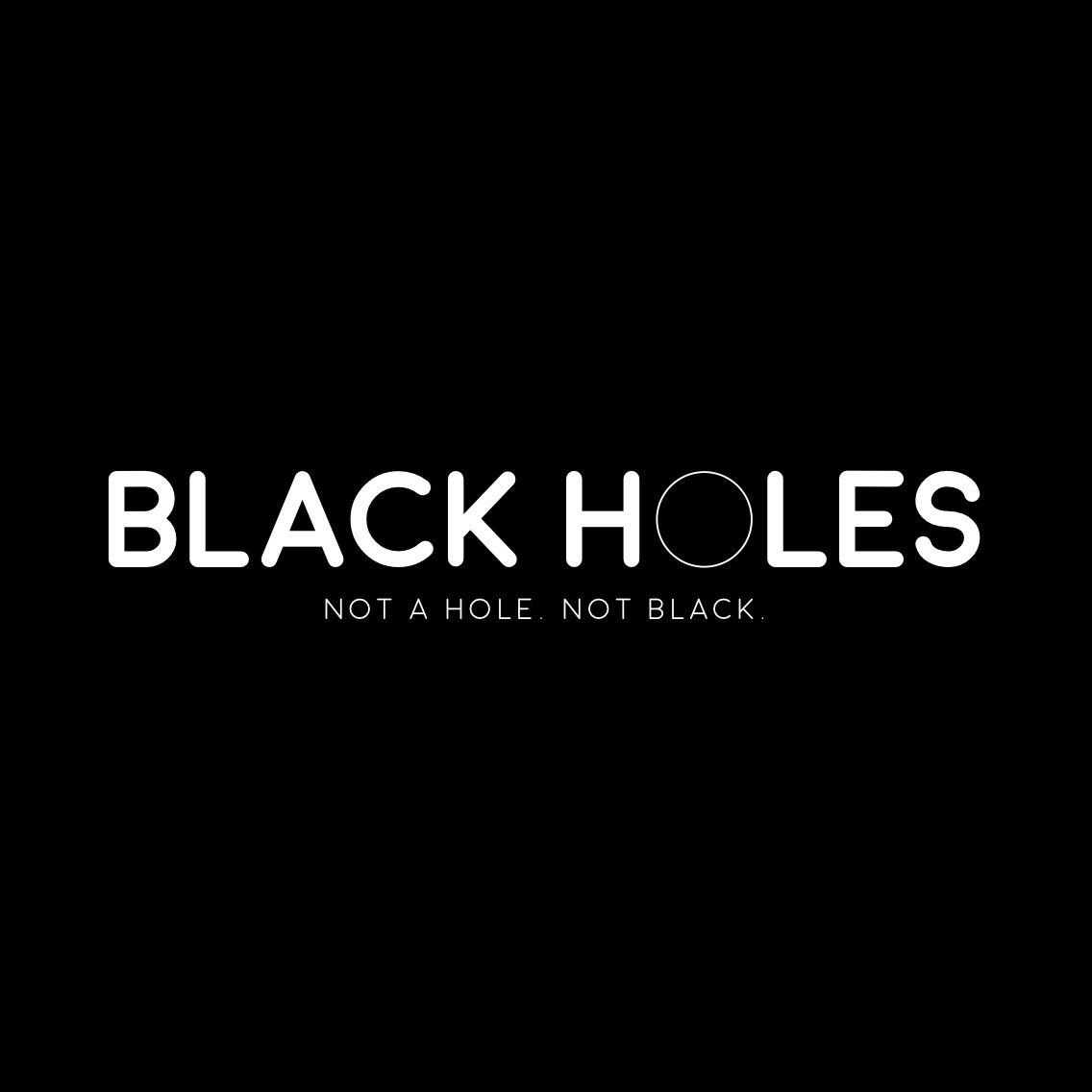
Alfa Kinda funny, but cute
Bravo It's meant to be a little bit funny to get people interested. But it's not cute cute
Charlie I dunno i feel like anything with rounded type is 'cute'
Delta I love the type choice! 😊👍🏽
Bravo Thanks delta :)
Echo What's it for
Bravo The first page of a pdf on black holes.
Foxtrot The periods are almost small enough to be lost. At first I didn't see them. Maybe add a teensy stroke just to fatten them up?
Golf Concept is good! Fun and interesting. Execution needs tweaking in my opinion. The play between positive and negative space is a bit boring for this concept. I think it has to do with the roundness of the typeface and the thin stroke of the o. Also ... Maybe it should read 'black hole' And not 'black holes' due to the subline? Not sure.
Hotel Nice
India Like the concept. Thickness versus the thin O may be a little too contrasting so maybe increase the thickness of the O a little or decrease the type thickness a bit. Love the bottom typeface but the other guy is right, the periods get lost. I didn't know they were there until I read the comment. Also side note looks a bit like the heroes logo from nbc