Go back

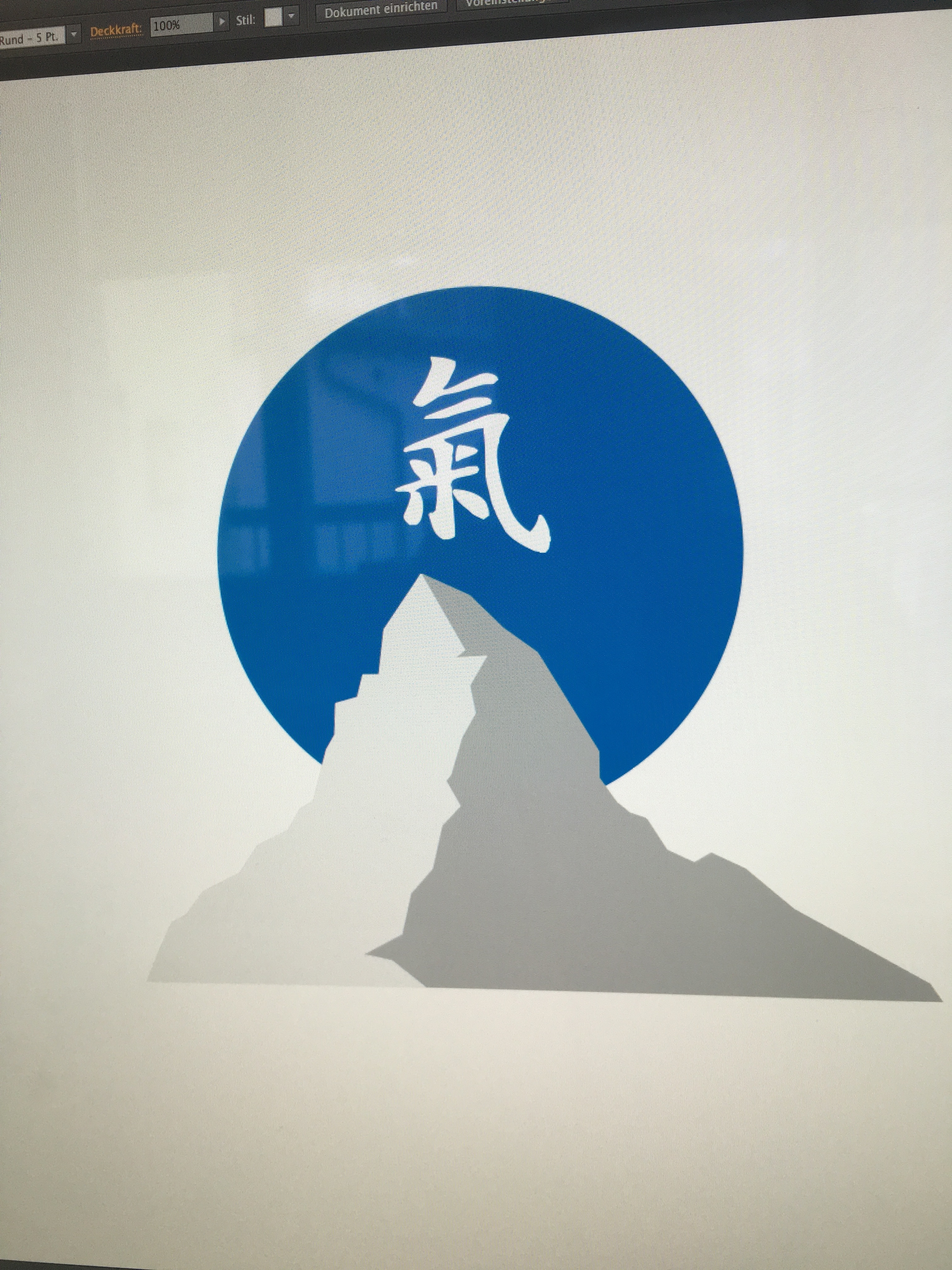
Alfa It's basically a logo for a health product to be sold in china. It should convey swissness and simplicity. I'm just not sure if the circle is too close to the japanese flag... Thanks for any feedback :) (the chinese symbol is "qi" which stands for life force, energy flow, air etc.)
Alfa And sorry it's just a picture of the screen. I just came across this app and this is the only image of the logo I have atm... :)
Bravo Maybe it seems a little Japanese. Can you do the mountain in more of a Chinese art style?
Charlie Looking at the logo it just seems not right like everything is t centred properly even if it isn't meant to be centred it feels like it should be
Delta The elements within the blue circle feel awkwardly aligned