Go back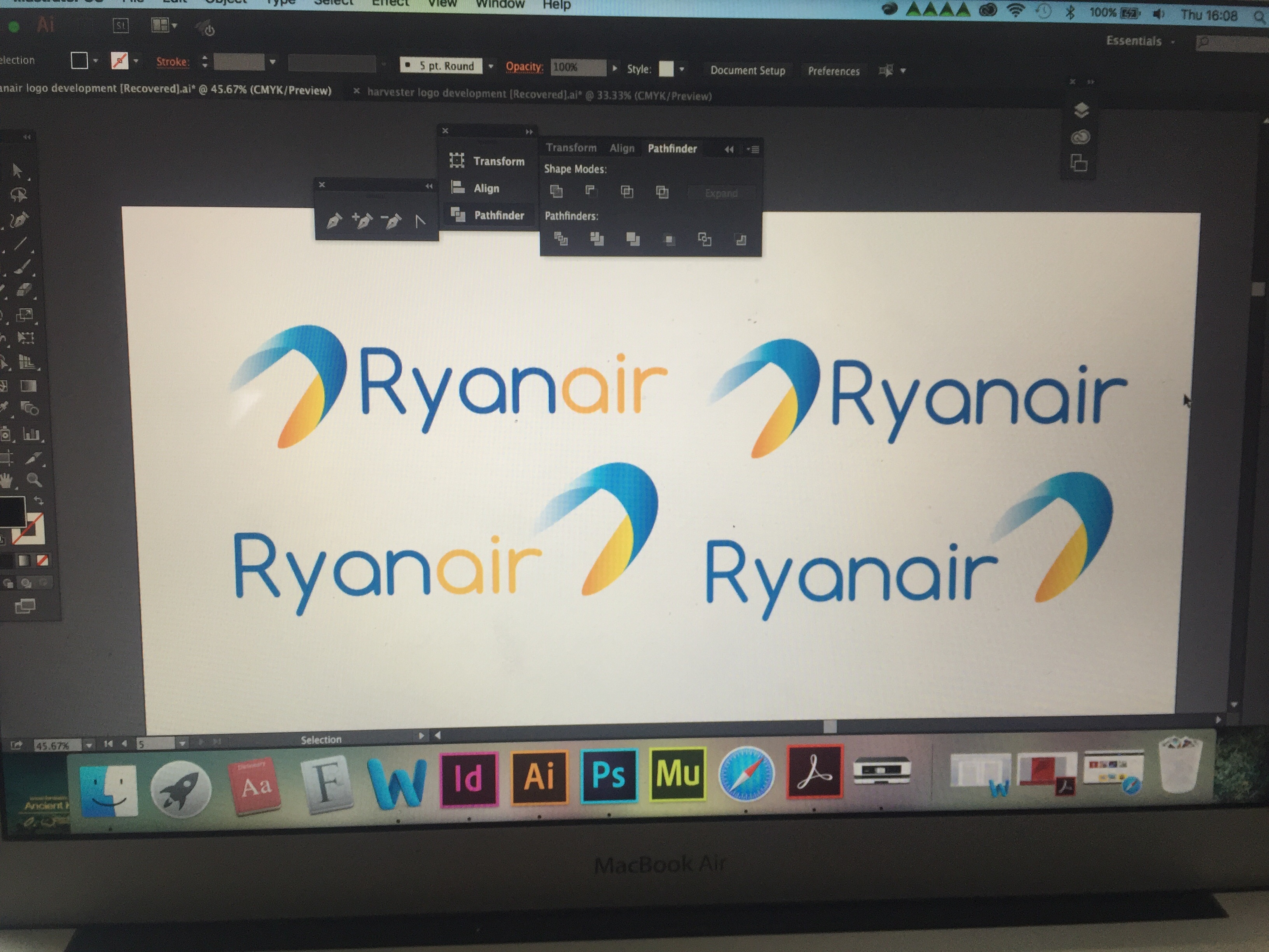
Alfa Blue and yellow ones
Bravo Colours are great. My feeling is that typography and symbol are too generic. A bit worried as well how it would look like without gradients. Would love to see a modern version of the angel/harp logo, can you do that?
Charlie The kerning on the 'y' needs adjusted.