Go back

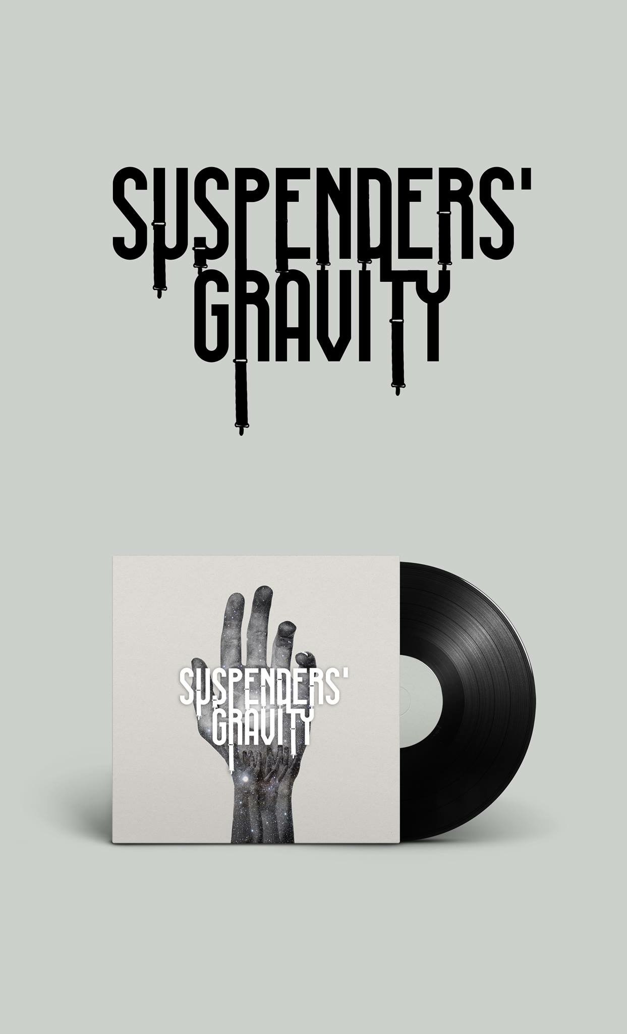
Alfa Love this concept! My only flaw and it's purely opinion is I'm not fond of how the suspenders touch the "G" and "A" of gravity, maybe cut into the letters and let the negative space outline the suspenders. I really like this though especially the sleeve!
Bravo Fill free space in letters and words a bit.
Charlie Thanks Alfa! You're absolutly right.