Go back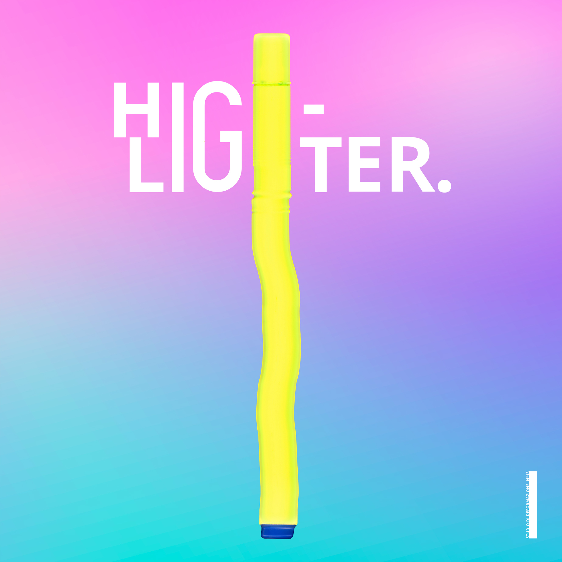
Alfa Whys it so long? And what's the blue thing at then end?
Bravo This is a mechanical distortion of a common Highlighter
Charlie Confusing.. I don't see how the highlighter represents an H.. I'd rather see it as an I.. And the watermark (I guess?) in the right corner looks more like a mistake
Bravo It doesn't represent the double H, but it cover them. And the shape in the right corner at the bottom is not a watermark. If all of us should follow the rules everything cannot change. Your comments are really out of mind, designer doesn't make that type of questions, so, who are you?
Charlie Well.. You put your logo up on a feedback page so I assume you're looking for that.. I'm not bashing your work, I'm telling you ways that I (keyword: I) think you can improve the logo. Whether you chose to change or not is up to you. Also, keep your opinions on what a designer does and does not do to yourself.
Bravo Ok... This is not a Logo this is a graphic design composition based on a mechanical deformation! Try to look the design as a field where u can imagine everything and create it. This is only an expressive project, not a Logo
Delta What is a mechanical deformation? I'm old.:/
Bravo It's a deformation created analogically
Echo This app is designed for feedback, good or bad, as a designer our work has to reach a wide market and should accept critisms from both sides.
Delta So what exactly happened in the process? Maybe then i make more sense of the blue part you know.
Bravo Echo this is not what I think
Bravo The object is been deformated I cannot explain anymore ;) and the blue part is only the bottom part of a common highlighter :)
Foxtrot I like it, it's odd, when you glance at it you see what it means, but when you look closer you get confused, I like that. But I'm not sure about the Instagram-ish background...
Golf I like the concept and the colours used. I agree it doesn't look like a 'H' and the line to the right of the 'highlighter' looks like a hypen.
Hotel This is not graphic design, but rather graphic art. Love it!
India I agree with H. But I also think this does not belong here. Neither B's slight provocation of designers working for people and want to create beautiful stuff rather than confusing/ disturbing graphics