Go back

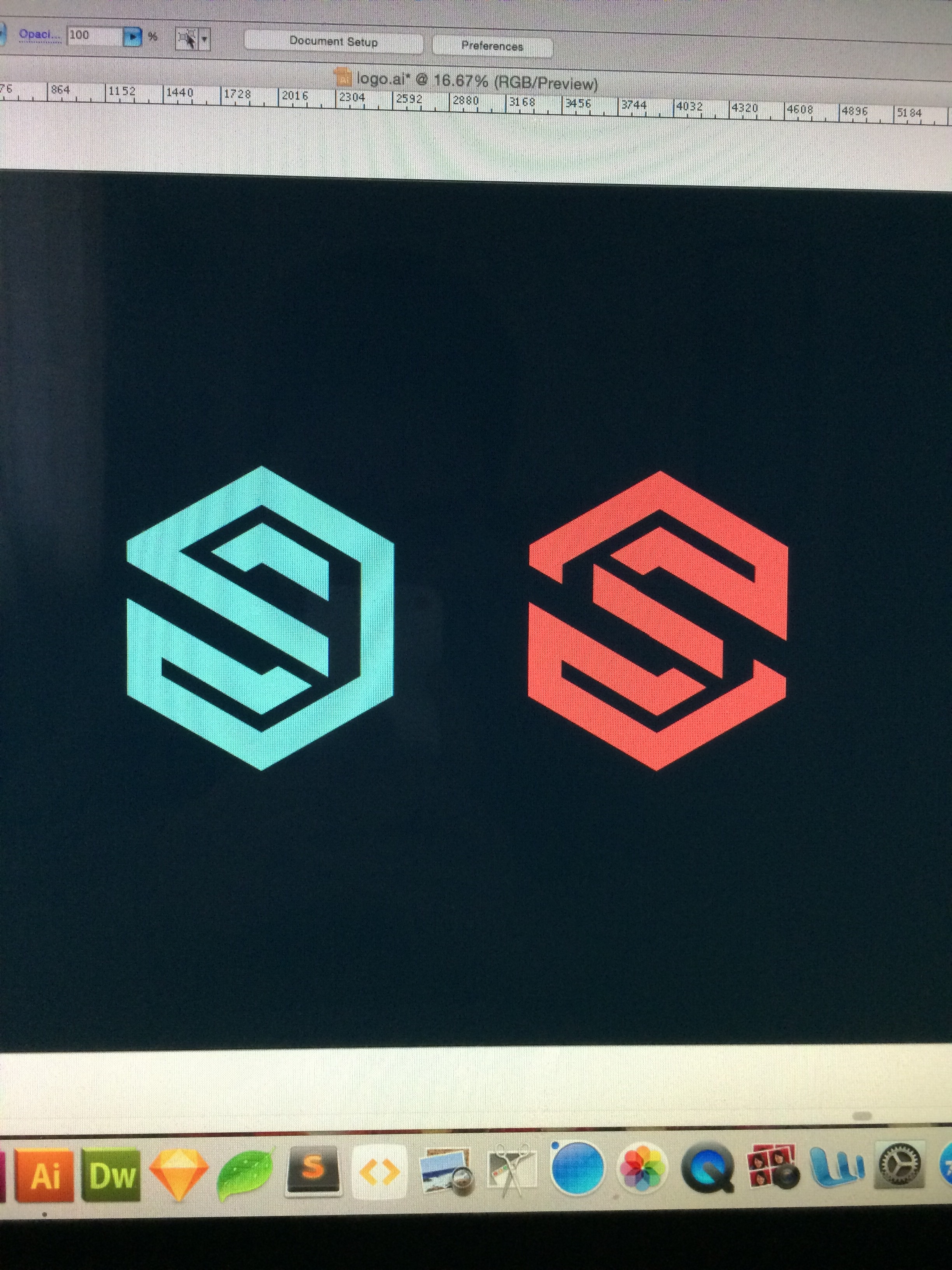
Alfa Does anyone see either of these as an S in a cube? Still a rough mock up but not sure if it's too abstract at this stage
Bravo The left one is more cube ish
Charlie And Alfa not really
Delta I see the s with no problem. The right one is
Alfa Would you say the logo could work if there is no need for the cube to stand out? The cube has no relevance really, it's just to add some decoration to the S
Echo The best way to emphasise the cube would be through flat vector tonal 'shadow'. Do not use gradient or drop shadow! Just colour a pane of the square a slight shade darker. Look into flat vector cubes to see what I mean.
Alfa Thanks for the feedback!