Go back

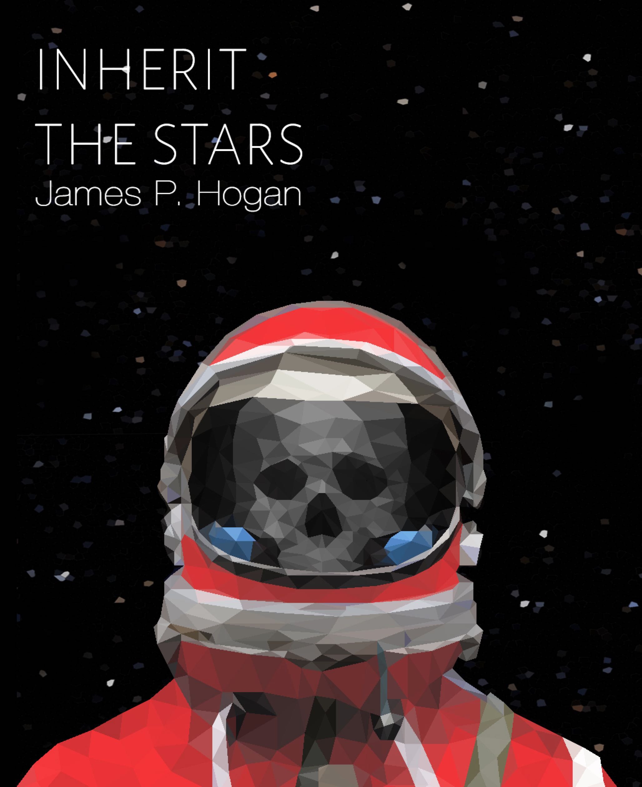
Alfa Tried to follow your advice, now the skull is a bit brighter, the eyes and nose have some shadows and I deleted the earth
Alfa What do you think? What can I change next to make it better?
Bravo It looks a lot better but it still doesn't look quite right - I can't put my finger on it. Maybe make the skull bigger?
Bravo It looks a lot better but it still doesn't look quite right - I can't put my finger on it. Maybe make the skull bigger?
Bravo It looks a lot better but it still doesn't look quite right - I can't put my finger on it. Maybe make the skull bigger?
Charlie Hi, maybe if you make the skull even darker in the depths and brighter in the heights? So that it descends even more in the background... and you could put another vertical highlight onto the glass... Very nice as a whole by the way.
Charlie Hi, maybe if you make the skull even darker in the depths and brighter in the heights? So that it descends even more in the background... and you could put another vertical highlight onto the glass... Very nice as a whole by the way.
Charlie Hi, maybe if you make the skull even darker in the depths and brighter in the heights? So that it descends even more in the background... and you could put another vertical highlight onto the glass... Very nice as a whole by the way.
Charlie Hi, maybe if you make the skull even darker in the depths and brighter in the heights? So that it descends even more in the background... and you could put another vertical highlight onto the glass... Very nice as a whole by the way.
Charlie Hi, maybe if you make the skull even darker in the depths and brighter in the heights? So that it descends even more in the background... and you could put another vertical highlight onto the glass... Very nice as a whole by the way.
Charlie Sorry for the massive amount of reposts, this commentary-function isnt working that good
Delta I think the shoulders should be wider since a spacesuite is so big and maybe a little higher so that it's more horizontal, not sure. Seems to me he has a really long neck, but looks cool!
Delta I think the shoulders should be wider since a spacesuite is so big and maybe a little higher so that it's more horizontal, not sure. Seems to me he has a really long neck, but looks cool!
Alfa Thanks you all guys your advices are really helping me out :*
Echo Hi, I would try to make the skull slightly larger. Seems to be too small.
Alfa I checked the size of the skull with a photo of an astronaut and it should be right, then I tried to change Its colour to make him fit better but the result it's not so different, thank you guys for your help
Foxtrot I hate fucking triangle art