Go back

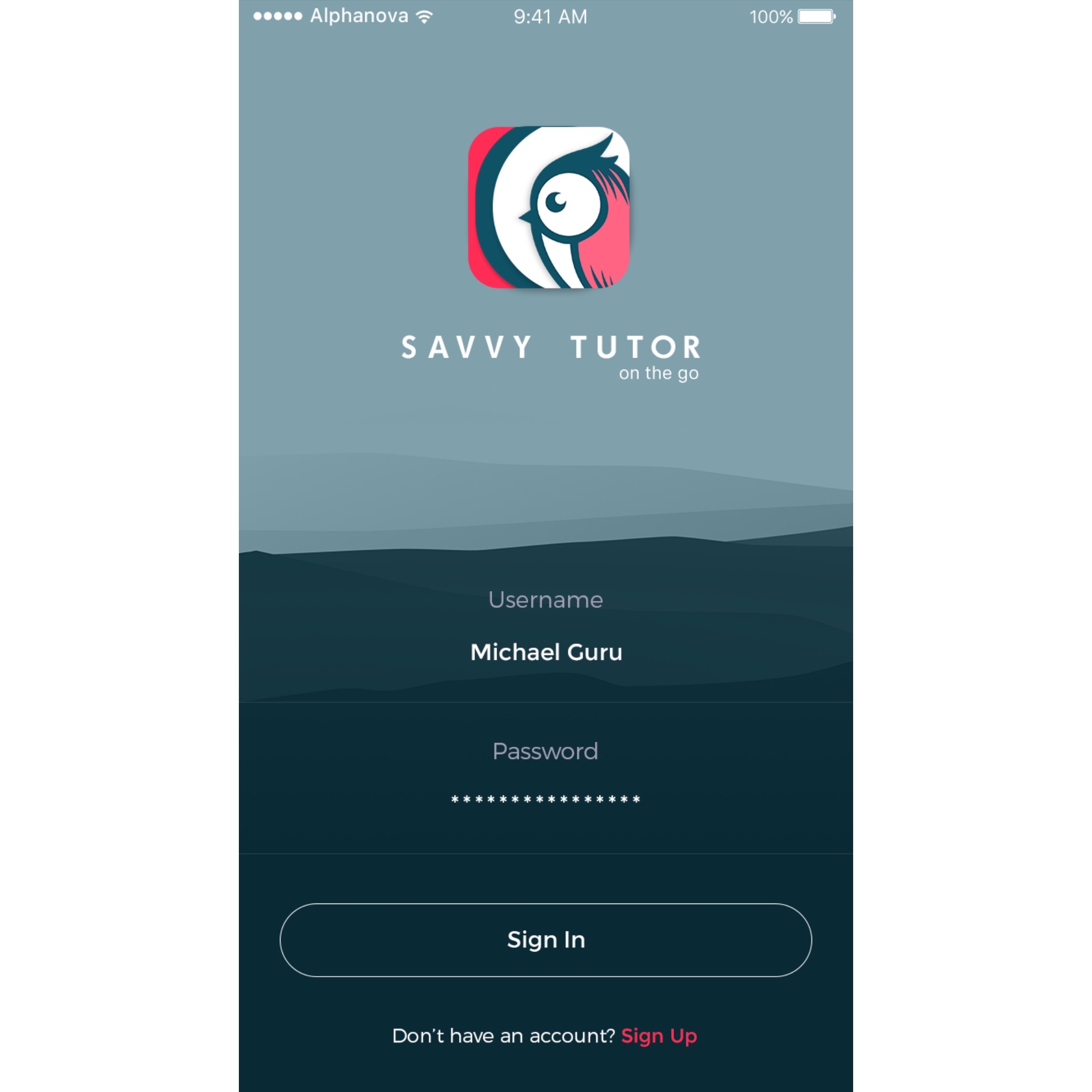
Alfa Love the background, icon would still be better without he dropshadows.
Bravo Love the icon. It's best with no drop shadows. Keep everything flat. Otherwise-Nice color palette, typography, white space. You might want a light line or something under username/pw places to show it's an entry field?
Charlie This is nice