Go back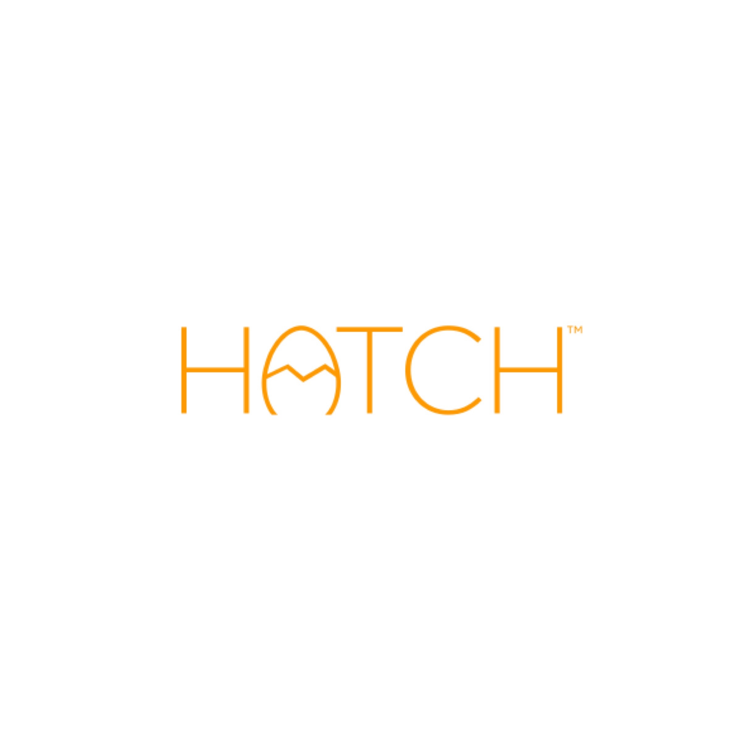
Alfa Hatch is a platform to launch new startup ideas. (Intentionally vague. Sorry) Need some constructive feedback to see if it works/what I could change. Maybe only 3 crack lines in egg instead of 4? Lemme know!
Bravo It's cute, 3 lines seems like it'd be good. The only thing bugging me is the bottom of the A how it bows in, kinda like it was a 0 and accidentally got cut off.
Alfa Yeah I don't think that's resolved well either. I need it to feel like an egg but also an A and don't know where to make that trim or taper.
Delta Maybe you can round all the ends, so less of a cropped off feeling.
Alfa Totally. Those sharp points are what suck. Thanks. All other suggestions welcomed.
Delta A whole egg might not be too bad, could always crack it open more.
Alfa Was worried whole egg would read HOTCH
Hotel I should nog change to much if you close the egg people will trad it as HOTCH, if you leave it like this it stays HATCH
Hotel Read*
Juliett Yeah I agree- round the edges a bit on all corners and youve got a great logo
Alfa Just did it. Looks way better and loses a degree of seriousness if that makes sense
Juliett Yeah, really nice! Repost the final
Mike Nice idea of the egg part of the letter
November I like it, but I first read it as Hotch
Oscar good work!)
Papa I think it just needs the crack to be symmetrical
Quebec Agreed with the crack