Go back
Alfa I like it.
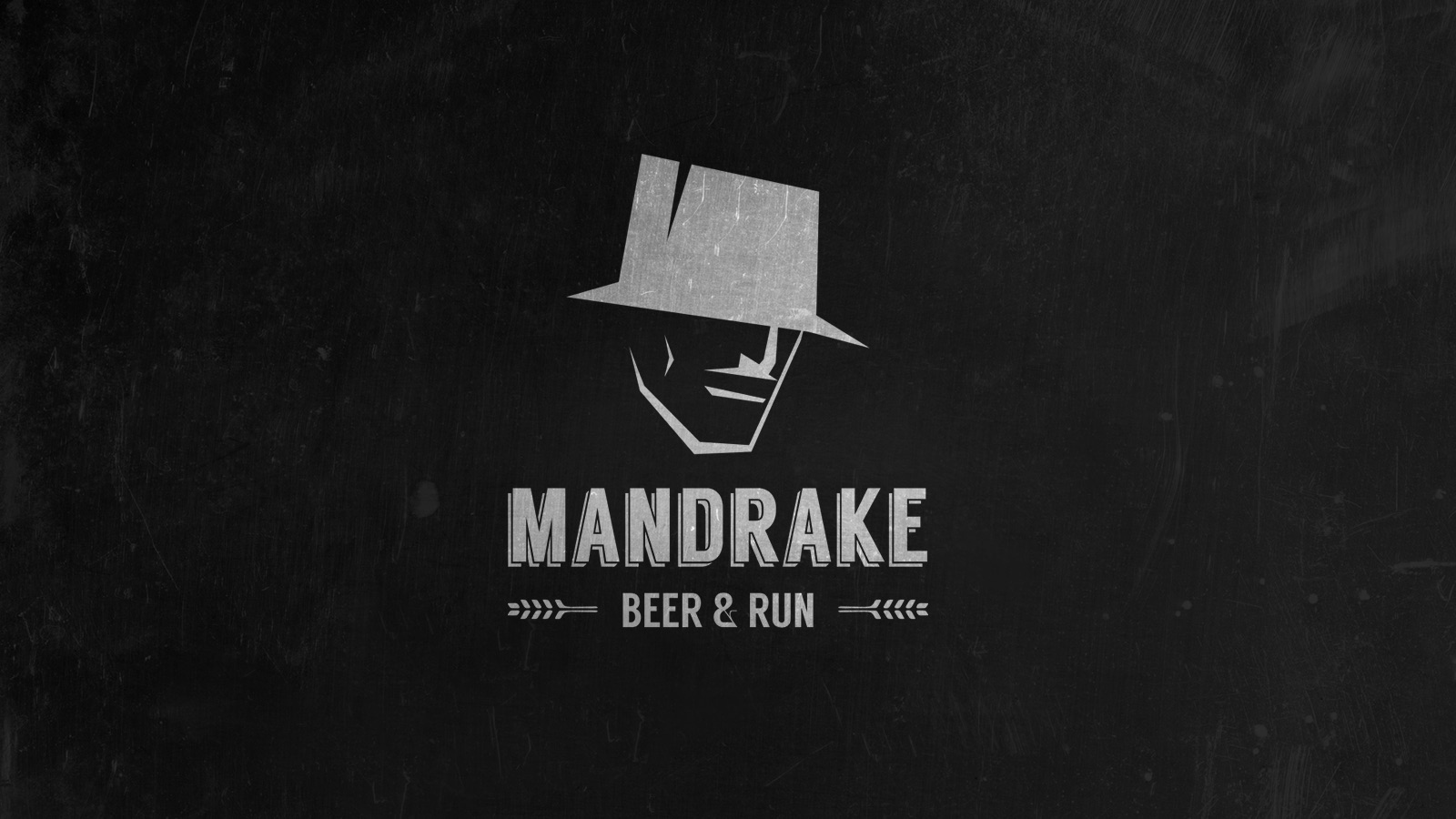
Bravo The hat isn't reading like a magician's top hat to me. Maybe add a band and make it taller/straighter? It kinda looks like a fedora now.
Charlie Like it, but simplify/ thin out the nose.
Delta Great feedback. Thanks
Echo I like the typo with the "flowerish" ornament at the side! The face needs some more precision