Go back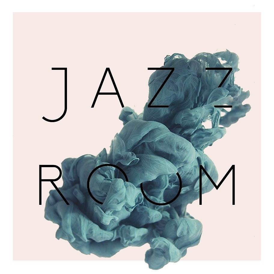
Alfa I think you should change the colour of the type to a lighter colour
Bravo That smoke is sweet
Charlie I love this!
Delta I can't make it out, is it smoke?
Echo Lovely!
Foxtrot Why is the j much bigger ?
Golf It is ink in water
Charlie I keep coming back to this and thinking WOW that's good!
India Very nice!
Juliett This image has been overly used, that's the first thing that comes to mind. Besides the photo and type, there isn't much going on here. I'm not making the connection of a jazz room and ink.
Kilo This is excellent!
Lima Very well!
Mike What's the concept? Do you own that image?
November Looks a lot like the temper trap album art
Oscar I've seen this concept a lot
Lima Nice
Quebec Agree this is over used
Romeo Super overused
Sierra Love the type treatment!
Tango There's that Temper Trap album cover that looks almost identical
Uniform Gotta agree it looks a lot like the temper trap artwork
Victor Might be overused but looks cool anyways
Whiskey Over over over used
X-ray Haven't heard of temper trap. Checked them out. I think this is better
Yankee Love it
Zulu How did you do this smokey effect image ? Looks awesome!
Dash Nothing Like jazz