Go back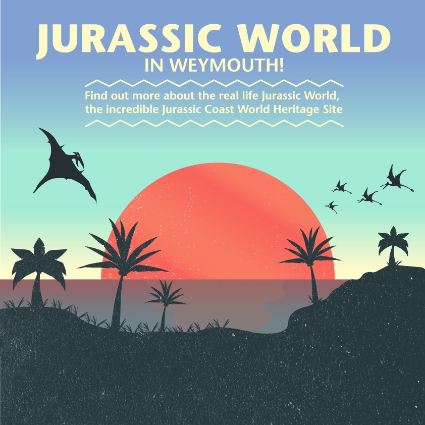
Alfa This one is more readable, but maybe smooth out the gradient a little
Bravo Loving the illustrations. The type doesn't seem to fit well, I'd explore different type combos.
Bravo I would also look at Tycho's album/poster arts, they have a similar color scheme.
Delta The harsh horizon line is confusing me...but I dig that orangy color. I like the harshness of the gradient.