Go back
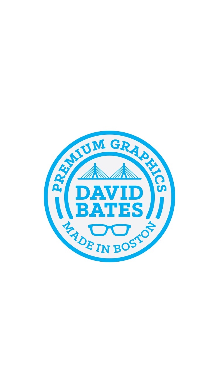
Alfa The various weights on the strokes and type comes off as really loud and busy. This logo tells me you're from Boston and you wear glasses, but it doesn't really tell me about you or creativity.
Bravo Nice comment, thanks! The line weights of the circle are actually the same, but the bridge is of course it's own thing.