Go back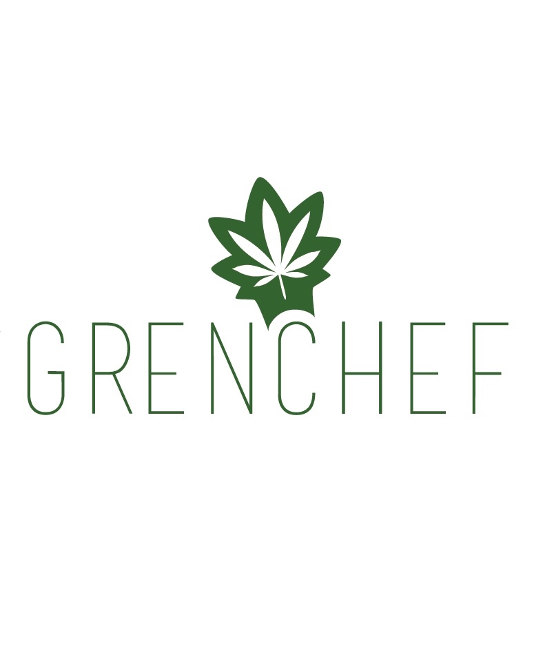
Alfa The bold logo doesn't fit the skinny text
Bravo I'll try to thicken it- but does it read as a chef hat? And green w one e is client request
Charlie yea i think it does
Delta It reads like a chef hat. Thumb up.
Echo I think it reads that way without putting it on the C. You could center it and try stylizing the bottom the hat a bit more and it's there. Definitely thicken the typeface to a medium, demi or bold
Foxtrot I like it on the C - but maybe A little more hat / less leaf .. Not much 😊 and definitely fat up the typeface. Thumb up
Golf No need for leaf it's too much the typeface by itself is already nice the leaf makes it corny and less professional. I can creating a separate logo for it
Golf U can create** try without the leaf/hat seriously :)
India The leaf hat is what makes it standout. Is it green or gren btw?
Bravo Client wanted gren