Go back
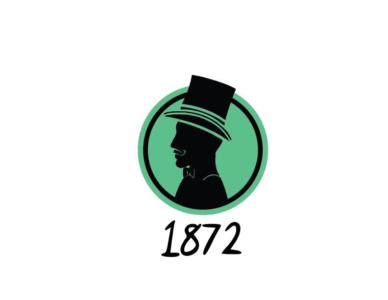
Alfa The silhouette needs tweaking to ensure the details of the face aren't lost when the logo or icon is scaled down.
Alfa And the font for 1872 isn't right for the period I don't think
Charlie I agree with both comments above. Very good points.
Delta There are too many lines on the hat's rim, and the green lines on the body are too thin. Overall, try simplifying the shape.