Go back
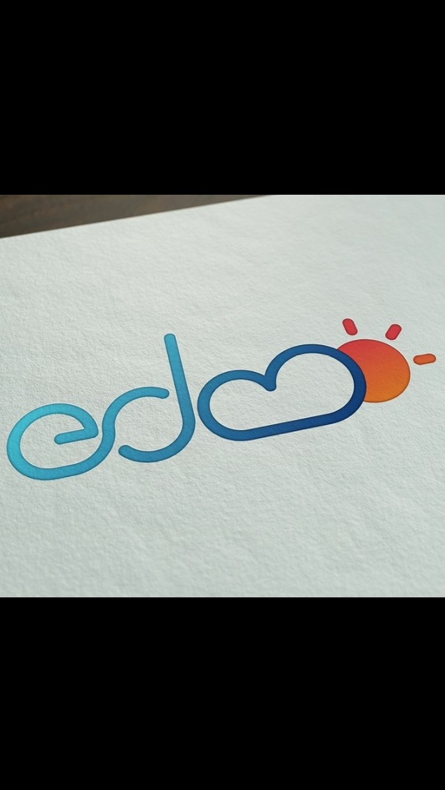
Alfa Edmo - Jet Ski & Hobie Rentals
Bravo It looks really awesome. But I didn't know what it said until I read the comment.
Charlie Agree.
Delta Yeh I'd never know it was for a jet ski company
Alfa I think it's the cloud which represents the "m" which isn't recognisable. Any suggestions or tips?
Foxtrot Remove a small bit of the "bottom" of the cloud. That should make the M read better. Also, don't worry about making it "look like its for a jetski company". The apple logo doesn't look like a "computer company" logo!
Alfa Much appreciated 👍
Hotel I think there is something wrong. The logo is reallyhardo ti reader
Hotel I think there's something wrong. The logo is really hard to read. The real problems are the cloud and Sun icons.
Juliett The cloud needs one more 'hump' and i think it would be down.
Kilo iCloud?